


Mandiri
Mandiri online is a mobile banking platform which owned by Mandiri. It helps the user to make transactions without going to ATM.
*Disclaimer: Study case was made before Mandiri Online rebrand to Livin' Mandiri
Role
UI/UX Designer
UX Researcher
UX Researcher
Timeline
3 weeks
Tools
Figma
Miro
Miro
Overview
Problems
Started with the problem's found, deep research were conducted to validate the problem and offer solutions to the user by creating a better experience for the solution. At this stage, research observations were using qualitative methods, secondary research, and competitor analysis. Secondary research was analyzed through social media feedbacks and app store/play store. Competitor analysts were done by comparing Mandiri online to another online banking platform.

Target Users
Mandiri online banking users who frequently used the online banking
Research
Research Process
Primary research were done through interviewed to six participants. Based on the findings, the results to the most problems users had experienced in using Mandiri Online are the flows to make a payment from the multipayment features, the interface as the icons were too big or the fonts were too small, and simplicity to make a payment.

How might we
Users need a simple flow access during transaction due to longer steps require much efforts and waste time, besides limited guideline may cause the user easily confused.
👉🏻 How might we make the user to be able to finish the transactions in a short time?
👉🏻 How might we make the user to be able to finish the transactions in a short time?
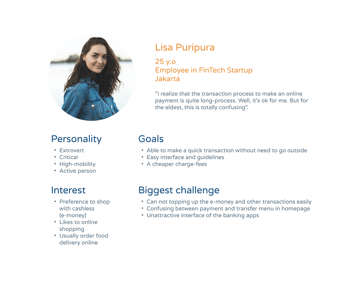
Persona
Solution Concept
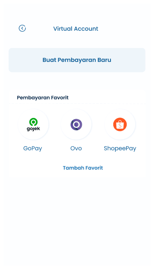
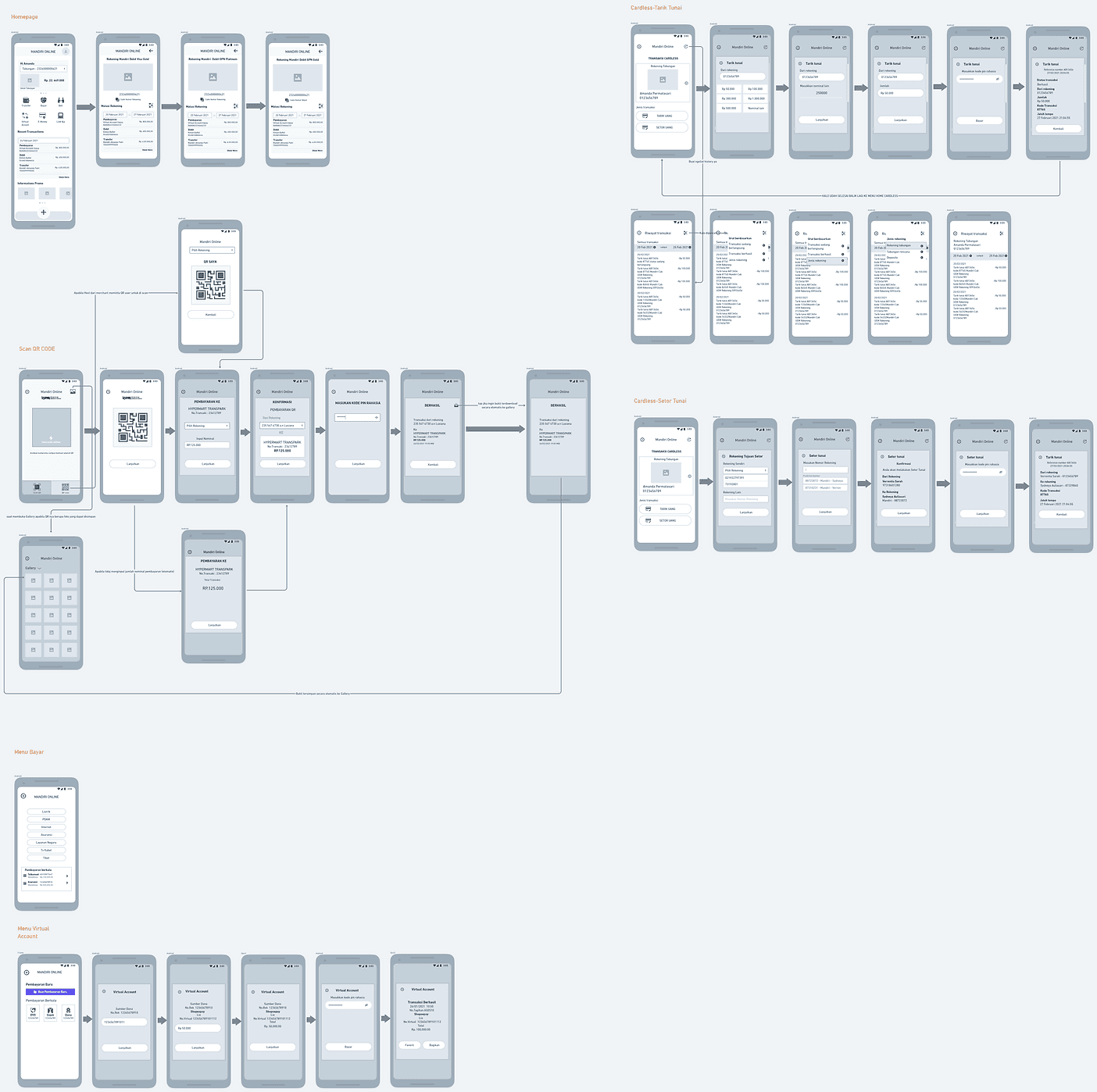
Based on observations, we offered solutions which were specific to redesign the online payment flows (virtual account), QR code and adds the cardless feature.

visual
Design Concept
The concept for stay with the brand concept from Mandiri.
Aa
SF Pro Rounded Bold
abcdefghijklmnopqrstuvwxyz
Aa
SF Pro Rounded Semibold
abcdefghijklmnopqrstuvwxyz
Aa
SF Pro Rounded Regular
abcdefghijklmnopqrstuvwxyz
Flow’s
Virtual Account’s Flow

Scan Barcode’s Flow

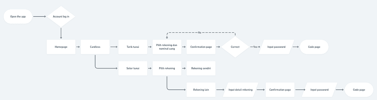
Cardless Flow
Storyboard

Wireframe
Hi-Fid

research
Usability Testing
Usability testing methods were used to understand that the redesigned products could meet their needs and able to solve their pain points. There were five participants in this UT's. The goals were to finish the scenario by assessing certain variables as User behavior, Learnability, and Accessibility.
🎬 The scenarios:
Participants are headed to enter the homepage and logged-in,
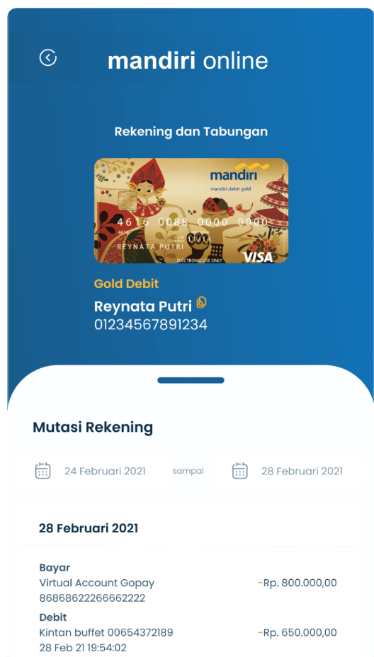
Participants are headed to purchase online payment by Virtual Account feature and finished the payment until he/she received the invoice which stated the transactions were successful.
Participants could make a Cardless transaction, both Tarik Tunai and Setor Tunai features.
Participants could make a Scan Barcode transaction in the QRIS feature until the transaction was successful.
According to the UT, the participants can finish the scenario well. Several feedbacks we received, we categorized based on the value of improvement as it will be major or minor improvement. Minor improvement we made were about the card preview, payment feature to be categorized with additional icons and improvement for the interface with ability to be developed. For the major improvement will be kept for the next iteration process.
🎬 The scenarios:
Participants are headed to enter the homepage and logged-in,
Participants are headed to purchase online payment by Virtual Account feature and finished the payment until he/she received the invoice which stated the transactions were successful.
Participants could make a Cardless transaction, both Tarik Tunai and Setor Tunai features.
Participants could make a Scan Barcode transaction in the QRIS feature until the transaction was successful.
According to the UT, the participants can finish the scenario well. Several feedbacks we received, we categorized based on the value of improvement as it will be major or minor improvement. Minor improvement we made were about the card preview, payment feature to be categorized with additional icons and improvement for the interface with ability to be developed. For the major improvement will be kept for the next iteration process.

Prototype
Access the final prototype through this link.