Halodoc, is a digital healthcare platform that offers a wide range of healthcare services. One of these services is an online pharmacy that allows users to purchase medicines, either after a doctor's consultation or directly for self-consumption.

Type
Study Case
Role
User experience, User Interface, Research
Duration
Nov - Des 2023
Problem Found
Scrolling through app reviews: some users share their bad experience when purchasing online meds
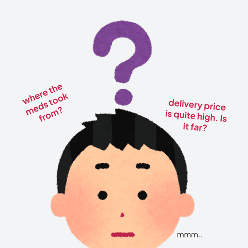
Feedback gathered from desk research in the App Store and Play Store for the Halodoc app indicated that users were mostly frustrated by the uncertainty of pharmacy locations and the limited ability to track drivers while buying medicine online.
“been questioning how the system choose pharmacy, cause I got the far one yet I needed it asap”

“Have conflict with the driver due to pharmacy location which is too far”

Validating the problems
Conducting qualitative research to validate desk research, hear the user’s experiences directly
Qualitative research conducted through in-depth interviews to six different users who use Halodoc in the past three months, gathered information and have a better understanding of their experiences and pains in using the apps
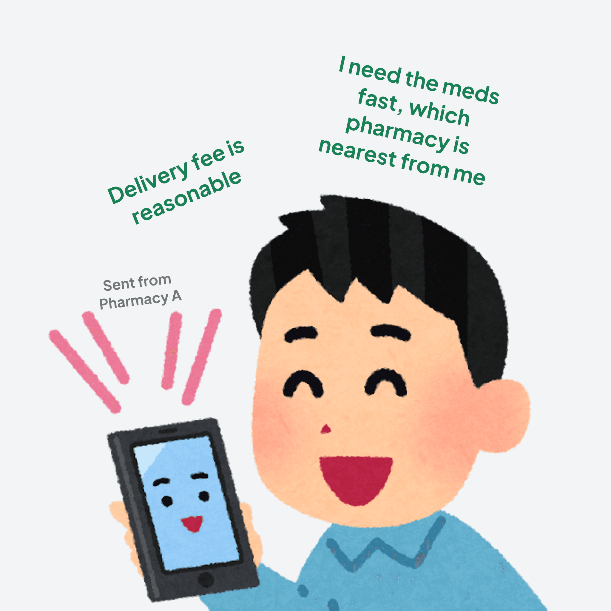
False expectations of pharmacy locations
3 out of 6 have pharmacy location issues as user expected to receive their online medicine quickly from nearby pharmacies. However, they experienced the opposite.
Price concerns
5 out of 6 concerns about the pricing in purchasing the online meds, which may related to the pharmacy distance locations
Driver traceability issues
2 out of 6 have trouble with driver while delivering the online meds
Analyzing Opportunities
How might we allow users to navigate their preferred pharmacy effortlessly?
From This
To This
Analyzing Opportunities
Simplifiy the process: Take medication immadiately
Allow users to have transparency and estimate the arrival time of their medicine.


Notes: The highlighted yellow is marked for the improvement area
Highlighted Problems
Long process in purchasing meds
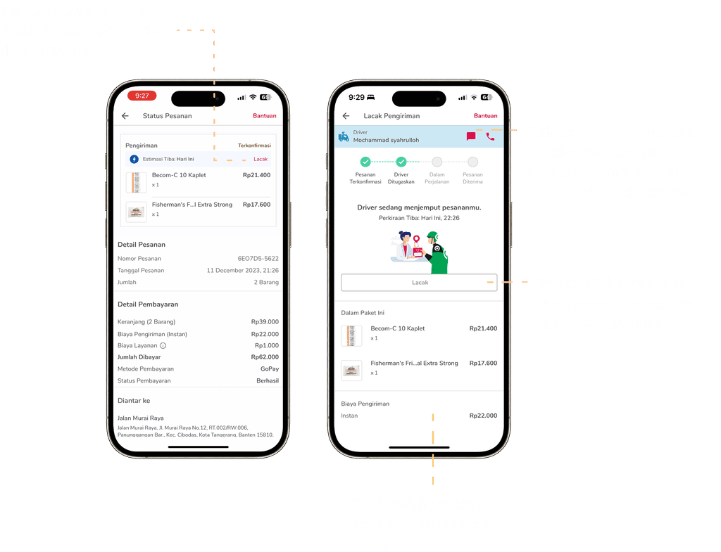
After the pharmacy is selected by the system, the user is directed to the cart screen, where no pharmacy location information is provided. Additionally, the user has to go through multiple steps before they can complete the payment.
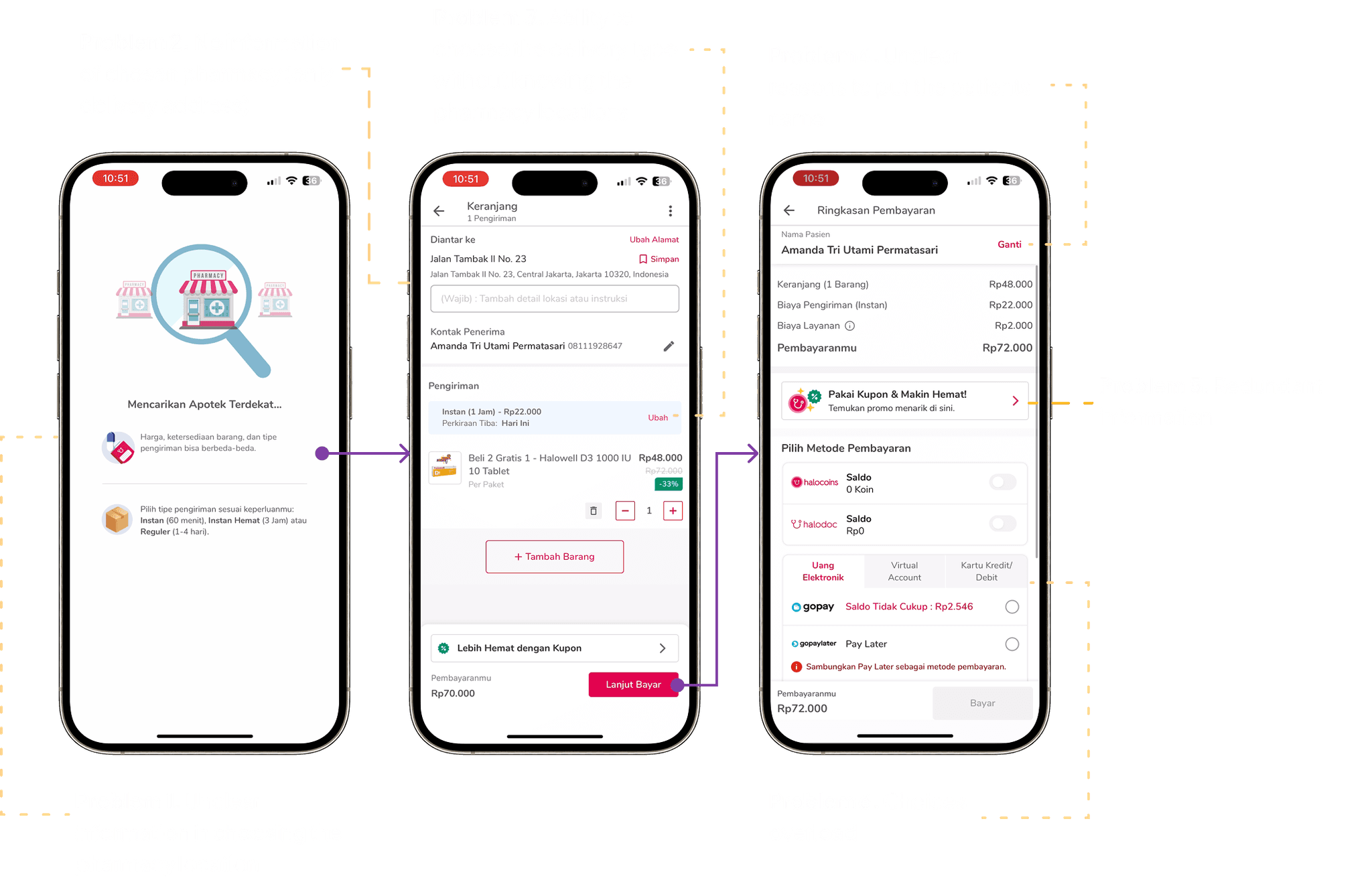
Improvement Ideas 01
Simplify the purchase screen
To streamline the process and reduce redundant information, I created the check out process to payment into one scrollable screen.

Improvement Ideas 02
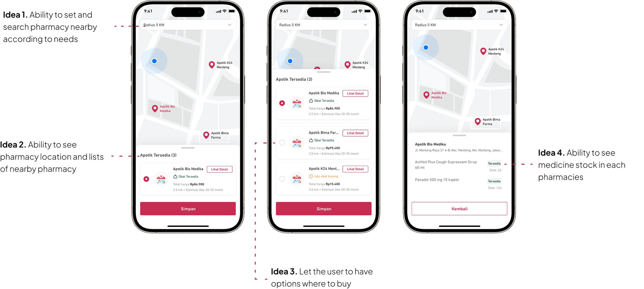
Being informed of pharmacy details
I proposed an enhancement idea allowing users to choose a pharmacy and view details such as the pharmacy's location and distances, estimated delivery time, and medicine stock availability for each pharmacy
Highlighted Problems 02
Driver is difficult to trace
The lack of driver traceability is due to an unnoticeable action button and the multiple layers required to track the driver's position
Improvement Ideas 03
Seamless driver traceability
To easily track the driver’s position and view order details, I added a real-time map with the driver’s traceable position and minimizable order details. I also included a real-time chat feature so users can easily contact the driver.

Usability Testing
Gathering User’s Feedback: What did user say?
I conducted usability testing through moderated sessions to gather user insights on improvements or any obstacles they still encountered. Five respondents were tested. Collected insights key points:
“The experience is much better, as what I expect to trace of my medicine delivery. But, curious to know what happens after delivery phase”
Consider: when the meds arrived and feedback given, then to whom the feedbacks will be given to? the pharmacy or the driver?
“I’d prefer using this flow better, because what I need is to know where the pharmacy is, also providing the medicine stock is good but I concern it is quite hard for some partners”
Reconsider to have meds stock feature
“It’s good and easy to understand. Recommendation meds are categorized, payment details and live tracking for driver is made me easier to locate my orders. Actually at first I was confused in searching the medicine, but it doesn’t matter”
New behaviour unlocked: two users said they directly search the meds from search bar
Users gave positive feedback on the current enhancements. I asked users to fill out the SUS form and calculated the results manually. The SUS score was 81.5, which is categorized as excellent according to UXPAjournal.org.
Reflection
Prioritization for next iteration
Create/make improvement for history order screen

Improvement meds stock
Some certain feedbacks needed to have a better understanding also from back office views. E.g the pharmacy stock according to the desk research through play store reviews showed a pharmacy tenant that has already updated the stock which is empty but still coming orders to buy meds from them.
Key Takeaways
Lessons Learned
Understand better the chosen tools for doing UT
Technical issues occurred during the usability testing. Initially, I intended to conduct unmoderated usability testing, but while gathering feedback, I found that over 50% of users did not complete the task scenarios due to skipping or dropping them. I discovered that the platforms did not allow for multiple methods to complete the tasks and did not support similar paths. In fact, most users used alternative methods to finish the tasks. With limited time, I switched to moderated feedback, which may have introduced some bias